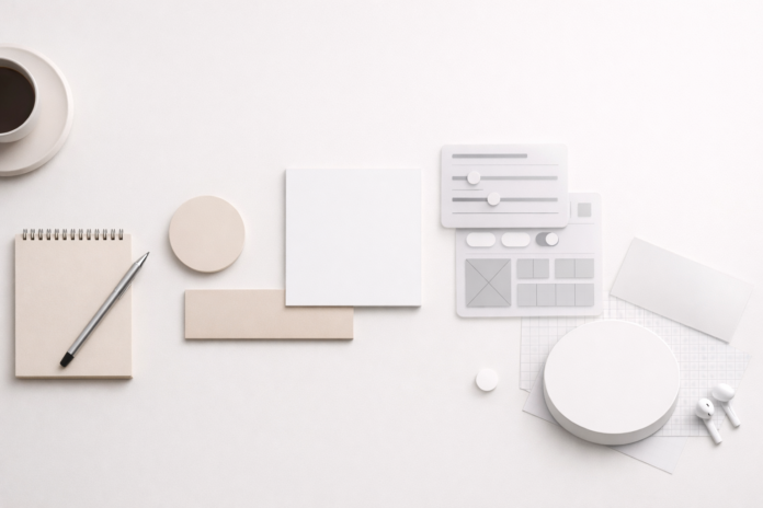
Minimalism is often misunderstood as “using less.” In reality, minimalist design is about using only what matters—and using it well. For creators navigating crowded digital spaces, minimalist design isn’t just a style choice; it’s a strategic advantage.
From websites and apps to branding, content, and product design, minimalism helps creators communicate clearly, reduce friction, and guide attention with precision. In an age of endless scrolling and shrinking attention spans, simplicity isn’t boring—it’s powerful.
This guide breaks down the core minimalist design principles every creator should understand, not as rigid rules, but as practical tools you can apply across creative disciplines.
1. Clarity Comes Before Aesthetics
Minimalist design starts with one essential question:
What is the single most important message or action here?
Before colors, fonts, or layouts, clarity must be established. A minimalist design succeeds when the viewer immediately understands:
- What they’re seeing
- Why it matters
- What to do next
When clarity leads, aesthetics follow naturally. When aesthetics lead without clarity, confusion follows.
Creator takeaway:
If you can’t explain your design’s purpose in one sentence, simplify before you stylize.
2. Every Element Must Earn Its Place
In minimalist design, nothing exists “just because.”
Every element must serve a function—visual, informational, or emotional.
This includes:
- Text
- Icons
- Colors
- Animations
- Decorative elements
Removing something is not a loss if it improves focus.
Ask yourself:
- Does this element support the main goal?
- Does it guide attention or distract from it?
- Would the design be stronger without it?
Minimalism isn’t emptiness—it’s intentional presence.
3. White Space Is an Active Design Tool
White space (or negative space) is one of the most misunderstood aspects of minimalist design. It’s not “empty space”; it’s breathing room.
Proper use of white space:
- Improves readability
- Creates visual hierarchy
- Reduces cognitive overload
- Makes important elements stand out
Crowded designs force users to work harder. Minimalist designs respect the viewer’s mental energy.
Creator insight:
If everything is emphasized, nothing is. White space creates contrast without adding noise.
4. Visual Hierarchy Guides the Eye
Minimalist design doesn’t remove structure—it strengthens it.
A strong visual hierarchy tells users:
- What to look at first
- What matters most
- What comes next
This is achieved through:
- Size variation
- Font weight
- Spacing
- Color contrast
- Alignment
Minimalist layouts are often simple, but never accidental. Every hierarchy choice is deliberate.
Rule of thumb:
One primary focal point per screen or section is usually enough.
5. Limited Color Palettes Create Stronger Impact
Minimalist design favors restraint over variety.
Instead of many colors competing for attention, minimalism relies on:
- One dominant color
- One supporting neutral
- One accent color (used sparingly)
This approach improves brand recognition, emotional consistency, and visual calm.
A single accent color, when used intentionally, can guide action more effectively than ten decorative shades.
Creator tip:
If a color doesn’t communicate meaning or guide behavior, remove it.
6. Typography Is a Core Design Element, Not Decoration
In minimalist design, typography does more than display text—it defines personality.
Because there are fewer visual elements, typography carries greater responsibility:
- Readability must be flawless.
- Font choices should align with brand tone.
- Line spacing and alignment matter deeply
Minimalist designs often use fewer fonts, but they use them with precision.
Best practice:
Two font families—one for headings, one for body text—are usually enough.
7. Consistency Builds Trust
Minimalism thrives on consistency.
Consistent spacing, colors, typography, and interaction patterns:
- Reduce learning curves
- Improve usability
- Build subconscious trust
Inconsistent design feels chaotic, even if it looks visually appealing.
Minimalist creators focus on systems, not isolated screens or assets.
Think long-term:
Design rules should outlast individual projects.
8. Functionality Always Wins Over Decoration
Minimalist design is deeply practical.
If a visual choice:
- Slows loading time
- Confuses users
- Distracts from the goal
…it doesn’t belong, no matter how attractive it looks.
This principle is especially critical in:
- Web design
- App interfaces
- Product pages
- Content layouts
Minimalism aligns beauty with usability—not against it.
9. Simplicity Requires Discipline, Not Less Skill
One of the biggest myths about minimalism is that it’s “easy.”
In reality, minimalist design demands:
- Strong decision-making
- Deep understanding of user behavior
- Willingness to edit aggressively
- Confidence to leave things out
Anyone can add more. Skilled creators know when to stop.
Minimalism is not minimal effort—it’s maximal intention.
10. Minimalism Is a Mindset, Not a Trend
Trends change. Principles don’t.
Minimalist design has endured because it aligns with how humans process information. As technology evolves, the need for clarity, focus, and simplicity only increases.
For creators, minimalism isn’t about copying a visual style—it’s about adopting a way of thinking:
- Purpose over polish
- Meaning over noise
- Experience over excess
When applied thoughtfully, minimalist design doesn’t fade—it lasts.
Final Thoughts
Minimalist design is not about making things look empty. It’s about making ideas unmistakably clear.
For creators competing in saturated markets, mastering minimalist principles isn’t optional—it’s essential. Whether you design interfaces, write content, build brands, or create products, simplicity will always outperform clutter.
The goal isn’t to remove everything.
The goal is to leave only what truly matters.


